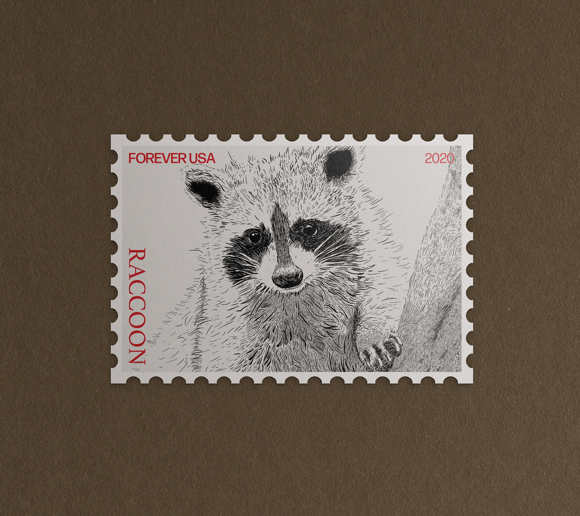
I illustrated a raccoon using a woodcut style in mind. I created the illustration using Procreate, I was able to modify the brush I was using easily. I could change the stroke width, the pressure of the brush, and how long I wanted each line to be. I then looked at some typography I wanted to use and fitted the stamp language. Black and red are very classic colors and I wanted to mainly show off my illustration so adding the red typography makes the raccoon stand out even more. It highlights the borders and space framing the raccoon enabling you to focus on the head while the typography is very visible and draws your eye around the stamp.