
My design is a brochure publication that displays what Blue Origin is about, what they’ve achieved, and what Blue Origin will be planning for the future. The viewer should learn something about space travel and possibly leave excited or wanting to get involved somehow. I researched Blue Origin to make a design brief and gathered the information I put on my spreads. I then sketched the layout, put together mood boards, and designed the final product involving printing, photographing my work, and editing my mock-ups.
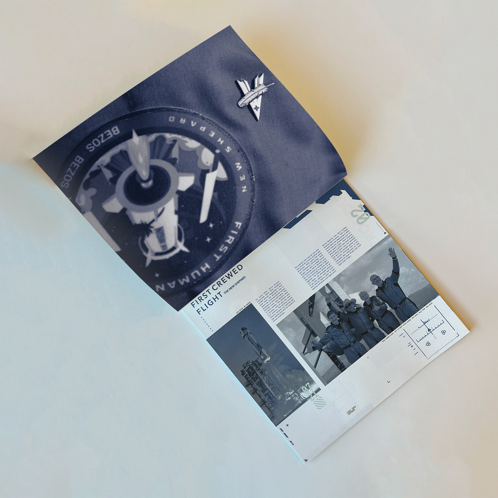
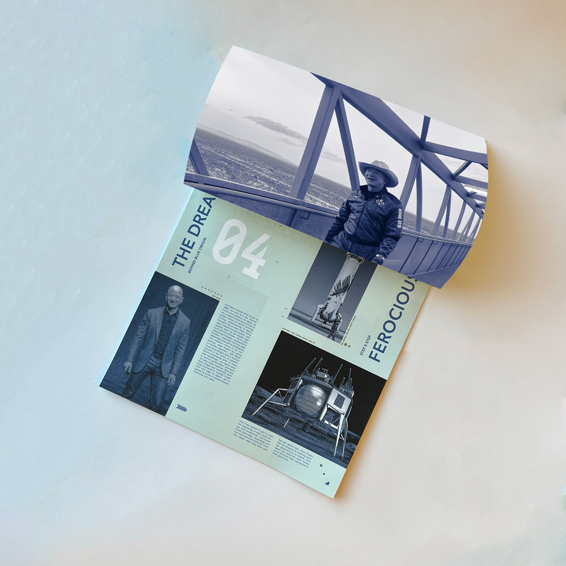
Page three features an insignia on a uniform about their successful rocket New Shepard followed by a spread about their first and successful mission. I talk about who embarked on the mission and what happened and the technology that they developed for New Shepard. All the photography used in the brochure came directly from Blue Origin, I used those assets and created other elements to support my design. In the following spreads, I discuss their founder and his mission. I wanted to highlight that and some of the various things they’ve been working on to build their reputation.
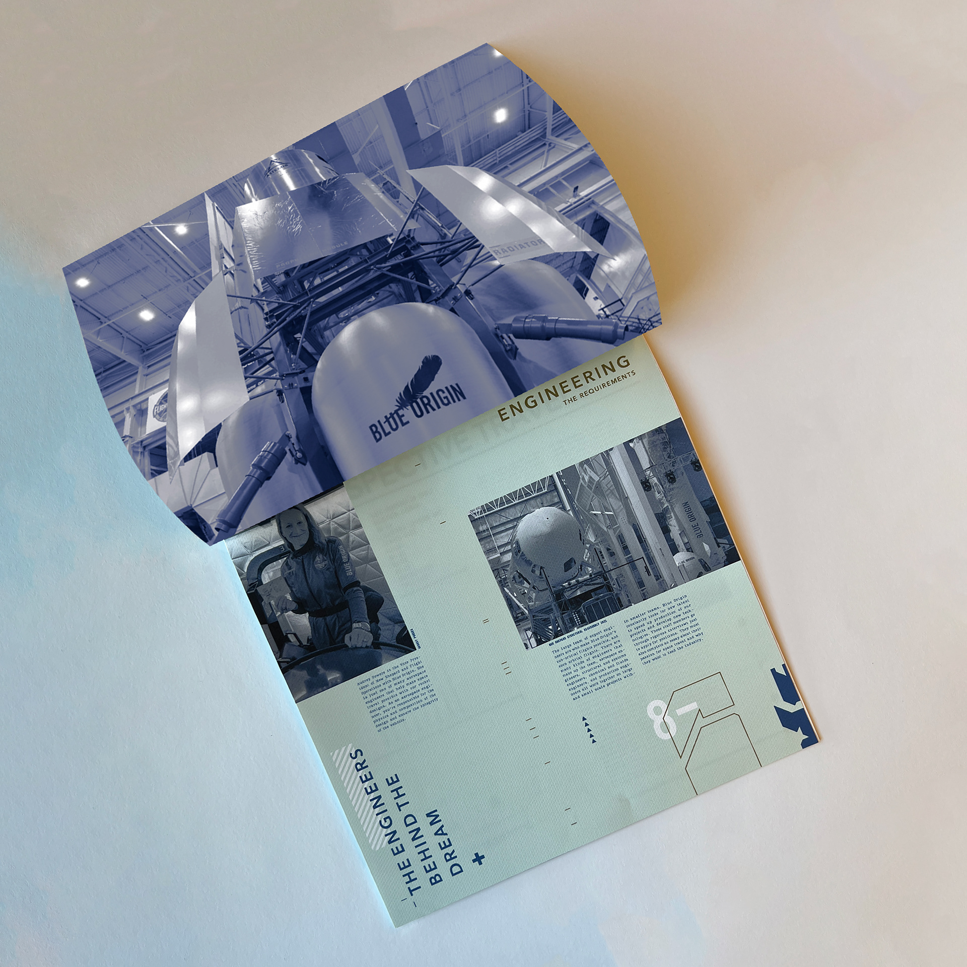
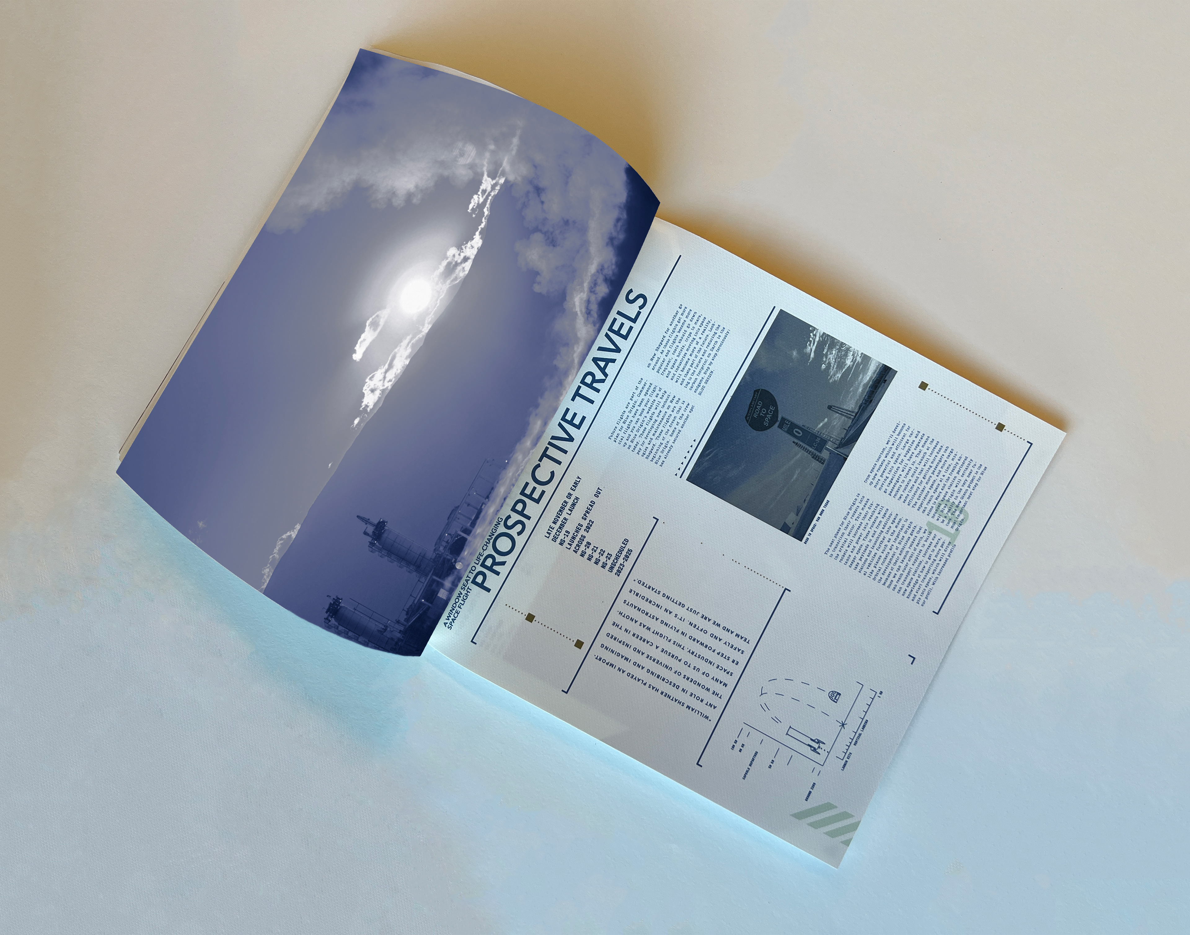
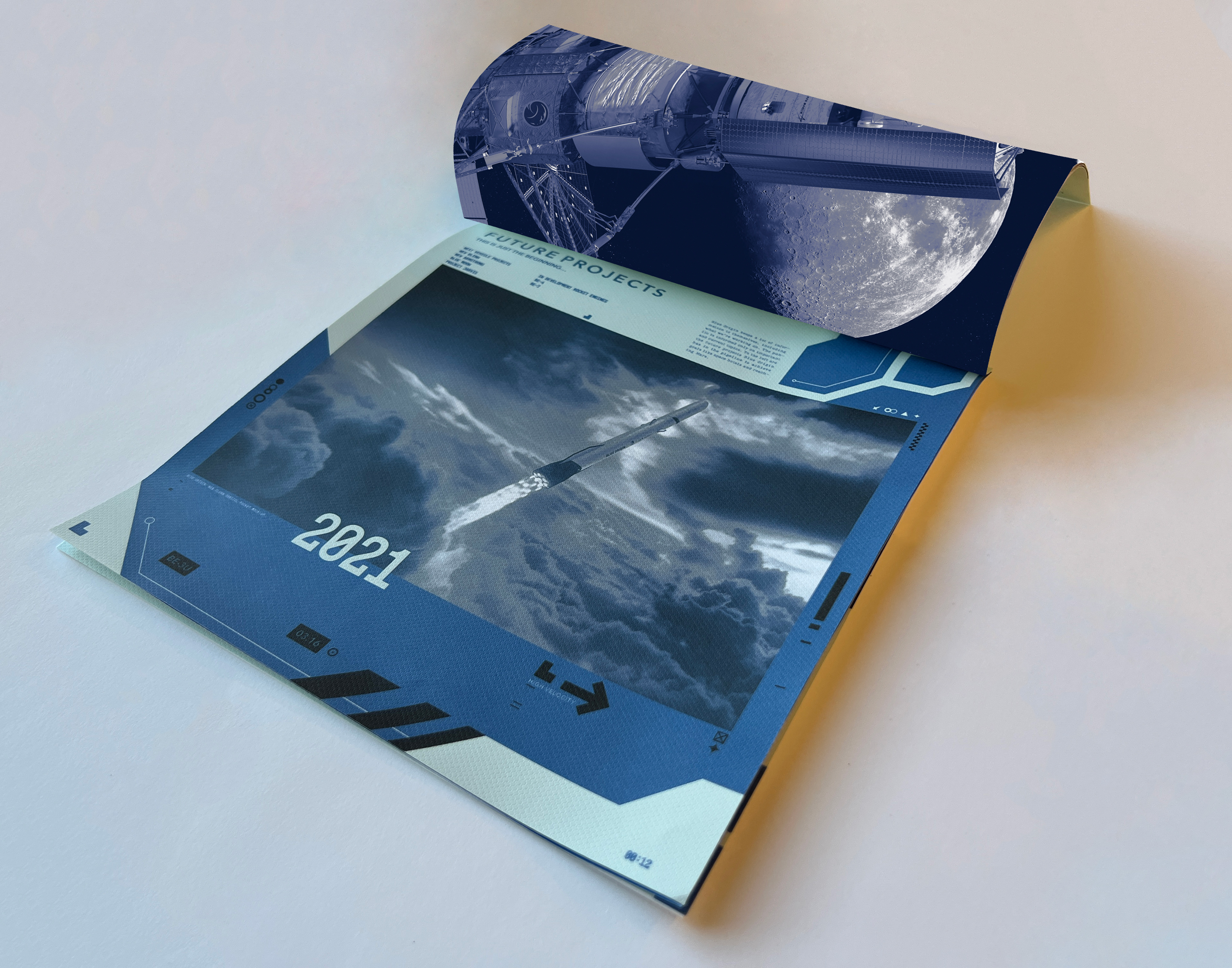
I highlight key systems on page eight making Blue Origin possible while mentioning some key people in engineering and operating. I want viewers to feel engaged with the work that Blue Origin is doing and one of the ways is to put into perspective the internal workings of the staff. Page ten highlights future flights into space and what they want to accomplish. I talk about what they need to accomplish to launch the flights and then why the flights are significant. I use supporting elements I designed on the left side to tell a story of the future missions coming, the things we learn and apply to the mission, and then the homecoming. The final shot features page twelve and it lists the future flights taking place that are scheduled.
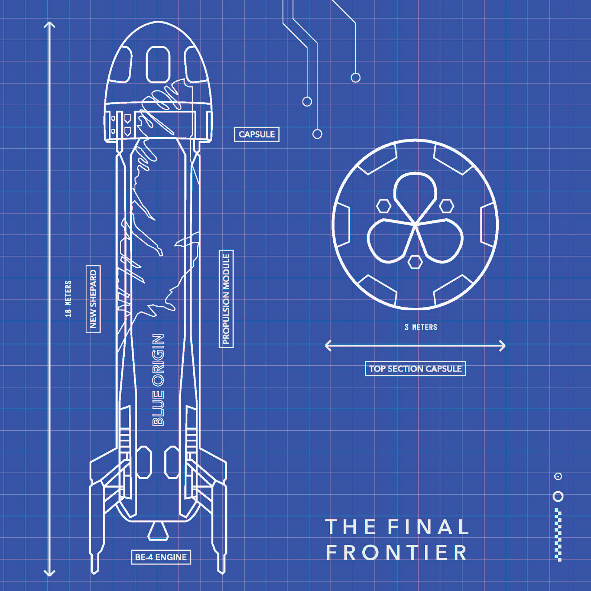
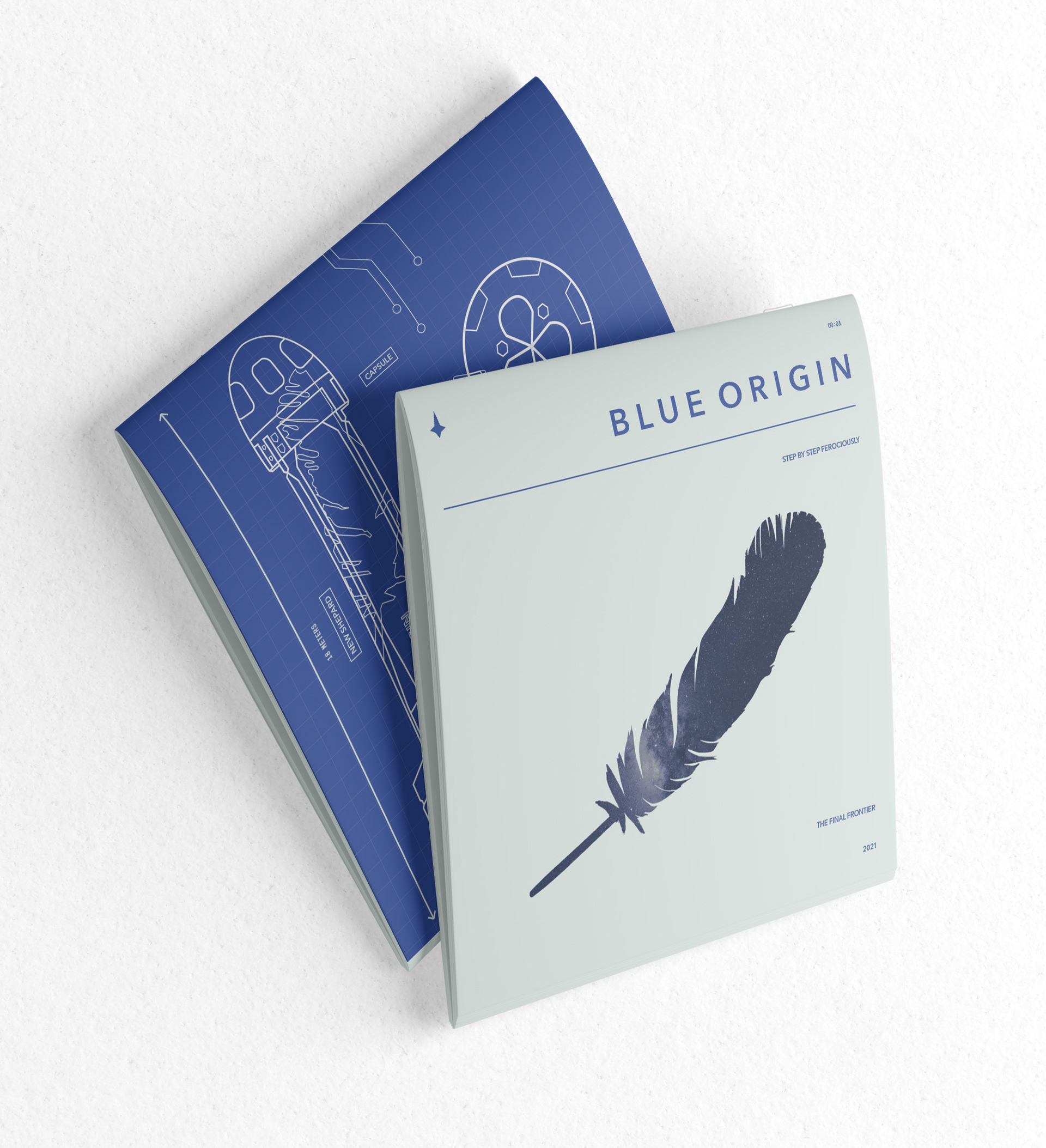
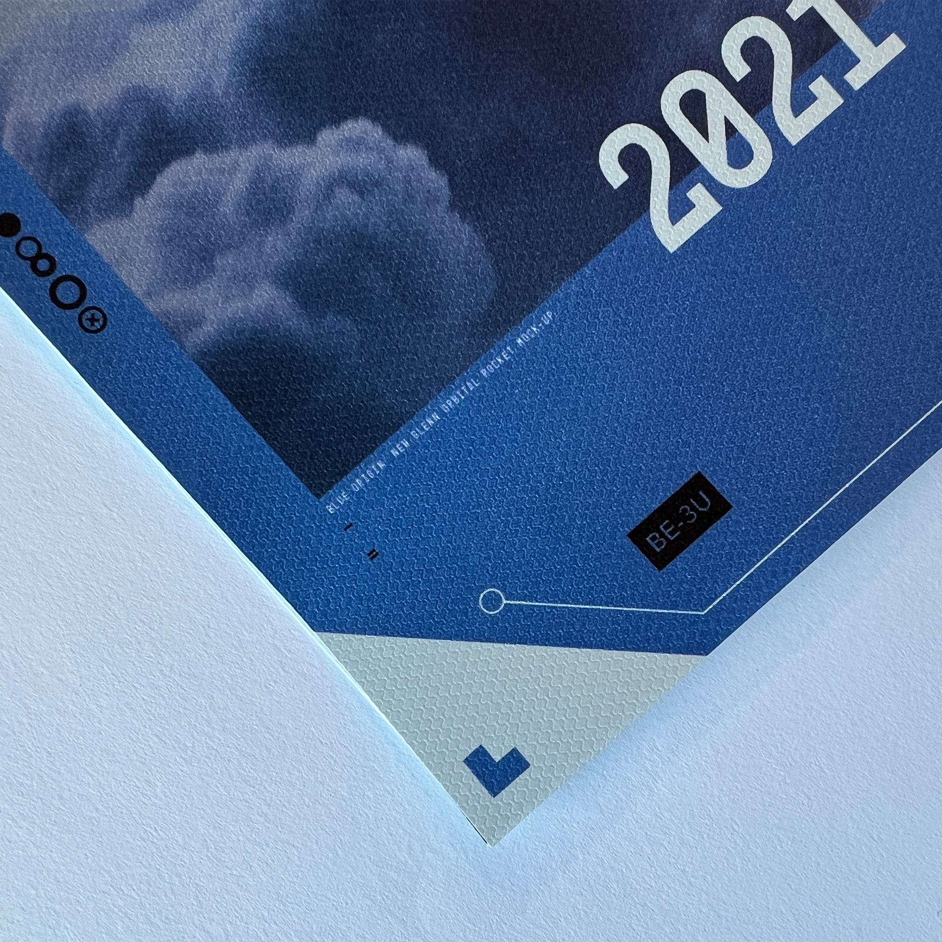
I designed this illustration for the brochure to reinforce the importance of their advanced New Shepard rocket. They utilize that rocket for their missions for manned flight and have carried out various successful missions. I used line vectors to fit the style I was using throughout the brochure and continue to reinforce the message about future space travel. I added a grid behind my design to demonstrate a blueprint kind of language. This ties everything together because Blue Origin has the recipe for success in the future of space travel.